If you’re a business owner, you probably have heard of the term ‘branding’. You probably have also heard that branding is a good practice that can help your business and that you should invest in branding.
However, before you can start investing in branding, you’d first like to understand what branding is. More specifically, you’d like to know what what branding in business is, and how it can or cannot help your business.
If this is you, you’re in the right place. Unlike many articles I have read online that explain what branding in business is in technical terms, I’m going to try to explain branding in 4 easy to understand concepts.
What is Branding?
When you do a quick online search for the term: what is branding? you’re going to come accross technical definitions such as this one from BrandingMag:
“The act of giving a company a particular design or symbol in order to advertise its products and services.”
Or one like this from investopedia.com:
“The term brand refers to a business and marketing concept that helps people identify a particular company, product, or individual”.
While both of these definitions are acurate, it can be difficult for non-technical readers to understand what this or this is. So, let give you a simpler analogy that can help you better understand what branding in business is.
Think of your groups of friends. If you don’t have any friends, think of your groups of acquaintances. People you hangout with, go bowling, dancing, partying, climbing or camping with.
Most (if not all) of the people in your group will have something that makes them unique. One of your friend might be know as the one who is scared of spiders and small bugs, but somehow loves camping alone in the mountain surrounded by wild animals.
Another one of your friends might be the one who is known for not knowing how to open a bottle of champagne.
Yet another, might be the one who cannot cook to save his or her life and is always burning food, including coffee somehow (I don’t know how anyone can burn coffee, but I’m sure it’s happened before).
The point is, each of us are unique. Whether we try it or not, over time, we start to develop a reputation. In other words we start to be known for something specific.
In simple terms, that is branding. Your brand is what makes you unique and distinguishable from others around you. Your brand is how people recognize you in a crowd. Your brand is how people feel when they think of you.
Your brand is your reputation
Just like your brand is your reputation, a business’ brand is that business’ reputation.
A business brand is what makes that business unique and distinguishable from other businesses. A business brand is how people recognize that business in a crowded online market. A business brand is how and what people feel when thinking of that business.
Branding in business is intentional
As I mentioned previously, whether we try it or not, overtime we start to develop a certain reputation.
Even if you are a bar or restaurant owner who has not put much effort into thinking about what or how your customers feel about you, eventually, the word will get out that your are the best restaurant around for sushi for example.
The word around town might be that you are THE bar to go to for the absolute best karaoke.
No matter what distinguishes your restaurant, bar, or business from others around you that will become your brand over time.
You will develop a brand over time whether you do something or not, but branding in business primarily refers to deliberately researching ways to distinguish your business from other businesses in your industry, developing strategies to standout from the competition, and implementing these strategies to help grow your business online or otherwise.
Branding helps your business be more memorable
A couple of months ago, I wrote an article about 3 simple ways to succeed at social media marketing. In it, I briefly discussed marketing. I explained that the number one goal of marketing is to be memorable. Branding is a marketing tool that can help you be more memorable.
Why being memorable matters?
In the article I wrote about social media marketing, I used the example of a company like Geico. When big companies create major tv ad campaigns, they don’t do it with the expectation that the tv viewer drops everything they’re doing and immediately purchases the product or service they’re selling.
TV (or any other) ad campaigns are meant to create memorable impressions in the viewer’s mind and psyche, so that when s/he needs the product or service in the ad campaign, they think of the company that created the campaign. That is the essence of marketing.
If your marketing strategy doesn’t include a way of being memorable, your potential customers won’t think of your business when they need the services or products you sell. That’s why being memorable matters.
How branding helps your business be more memorable?
Branding makes your business be more memorable by creating consistent, unique, and recognizable messaging and imagery.
One of the most important tools you will need to create as you build your brand is a brand style guide. In short, a brand style guide is a “rulebook” that tells your customers, employees, and partners what your brand is, what it looks like and what kind of messaging your company uses when interacting with the outside world.
Below is an example of a brand style guide we worked on for a client: trustedcareohio.com. This is a shortened version of a brand style guide, often called a brand cheatsheet.
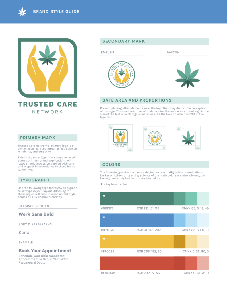
Some of the components of a brand style guide are:
Brand Story
Your brand story is a simple description of what your company is about. This can include your mission statement and/or your company’s goals and vision.
Logo/Brand Name
This component of a brand style guide is the most famous one. When most people think of a brand, they first think of the logo.
Your logo/brand name is one of the most important parts of your brand. It’s one of the first interactions the outside world will have with your business.
Though the logo is an important part of branding it isn’t the only one.
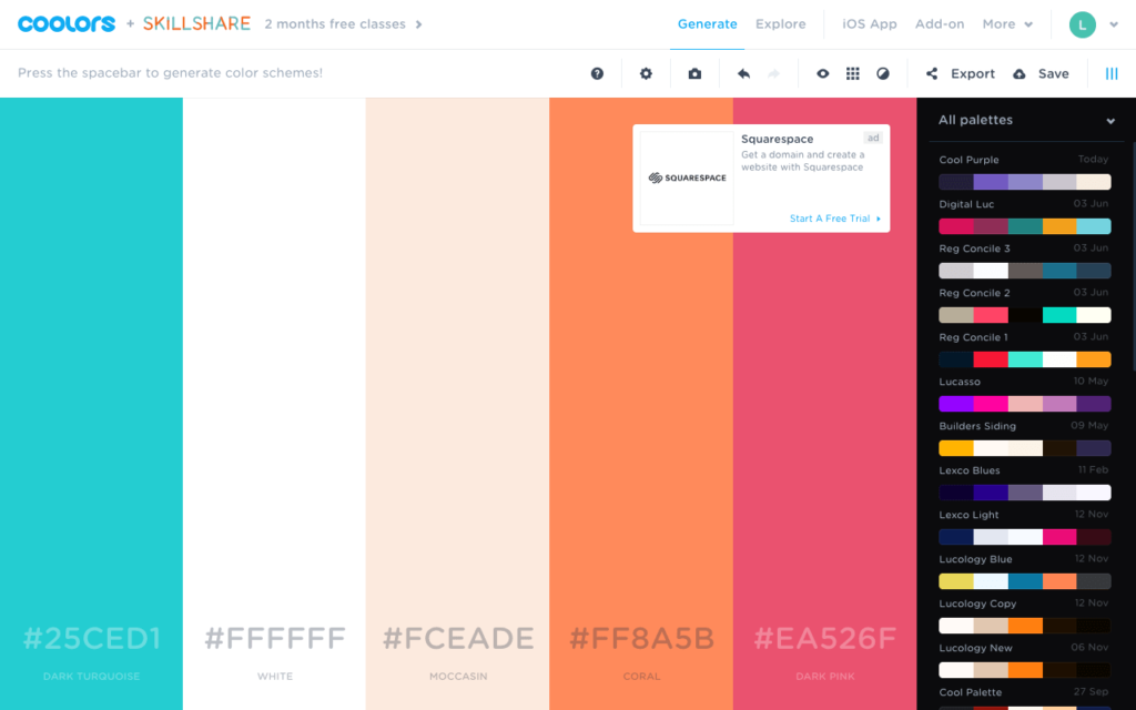
Color Palette
Your color palette can tell the world a bit more about your company through the magic color psychology. In short, color psychology refers to the idea certain colors inherently evoke certain emotions in humans.
For example, blue is associated with calm. Red evokes energy/passion. Yellow is associated with optimism.
Your choice of colors for your brand will can help you express your values or tell the story of your company.
Typography
Like colors, typography can inherently evoke certain emotions. Choosing a typeface (font) that is unique and appropriate for your business can enhance your brand recognition, and help you stand out in a competitive market.
Imagery
Imagery refers to the images you use in your marketing efforts. Whether in print advertising, online marketing, digital paid ads, it’s important to have consistent imagery so your customers can always recognize your products and services across different marketing channels.
Voice/tone
Your voice/tone is what kind of language you use in your marketing efforts. For example, if you are a dog grooming business, your tone can be friendly. If you are a law firm, it would be more appropriate to have a more serious tone. No matter what tone you decide to use, it’s important that your tone remains consistent across your all of your marketing channels.
When crafted carefully, each one of these components can help your brand be more unique and recognizable. Together, however, they combine to create a brand that can give your business even more brand recognition.
Ensuring that your logo, color palette, typography, imagery, and voice are consistent across all of your marketing channels will help your customers associate your product and services with your company.
Moreover, if all of these components remain consistent everywhere, it ensures that every impression you make on a new or existing customer increases the chances that they will remember your business when they need your products or services.
Branding in business helps you communicate
As you grow your business, you’ll gain partners, hire employees, get affiliates. Without a brand style guide, some of your partners might stretch your logo in a partner ad campaign. An employee could use a different color than the one on your logo for a flyer.
A brand style guide is a communication tool that will let all of your stakeholders know exactly how (and how not) to use your logo, what kinda phrasing, and images to use in any marketing materials.
Branding in business will put everyone who wants to promote your business on the same page.
When branding is done right it can serve as a communication tool for business owners in 3 important main ways:
- Branding tells your employees what to expect as a part of your company.
- Branding tells your partners and stakeholders how to market your company.
- Branding tells your customers what to expect when interacting with your business.
Conclusion
In summary, you can understand branding using these 4 simple concepts:
- Your Brand is your reputation (What you’re known for).
- Branding in business is intentional (Unlike the reputation you could build without doing much).
- Branding helps your business be more memorable.
- Branding can help you communicate.
Once you understand these four concepts, it’s easier to understand the importance of branding in business.
I hope you enjoyed reading the article and/or that you found it helpful. If so, feel free to share.
For questions or feedback, leave a comment below.